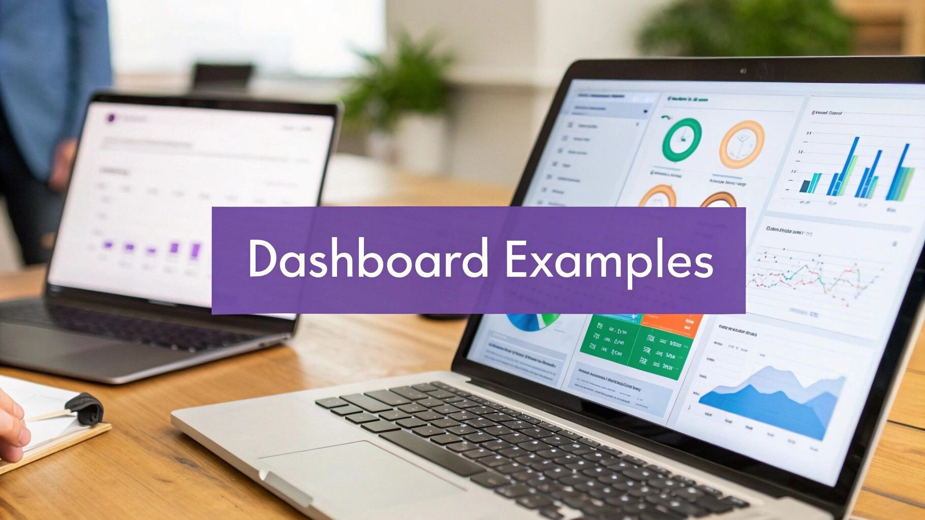
Business Dashboard Examples: What Earns a Spot on Yours
Most business dashboards are wallpaper. Here are dashboard examples and patterns that earn their place, from sales teams to operations and finance.
July 5, 2025
Updated May 2026. Reorganised around dashboard use cases rather than vendor profiles, with the patterns we see actually used (and the ones that quietly get forgotten).
Most business dashboards are wallpaper. They get built with great enthusiasm, demoed once, and then nobody opens them again. The dashboards that survive share a few specific shapes, and they tend to look quite different from the polished demo screenshots vendors put on their websites.
We are Osher Digital, an automation and analytics consultancy in Brisbane. We have built and reviewed several dozen dashboards over the last few years across Tableau, Power BI, Looker, Metabase, custom React, and an embarrassing number of Google Sheets that grew teeth. This guide is the pattern library we wish someone had given us before the first project, organised by what the dashboard is actually for rather than by which vendor offered the best demo.
For background on the broader topic, our piece on data validation techniques covers the upstream work that makes any of this trustworthy. For the integration angle, see our overview of system integration best practices.
Why most business dashboards quietly die
Three patterns account for almost all the dashboards we have watched go unused.
The dashboard answers no specific question. It shows revenue, cost, customer count, and a few trend lines. Lovely. What does the viewer do with it on a Tuesday morning? Nothing, because nothing on it triggers a decision. Dashboards that survive answer one or two questions someone genuinely needs answered before lunch.
The data is stale, wrong, or both, and nobody trusts it. We have seen sales teams maintain a parallel spreadsheet because the official dashboard was a day behind and missing two key reps. Once trust is gone, you do not get it back by polishing the colour scheme.
The dashboard tries to do everything. Twenty charts, six filters, four tabs. Faced with that, the user opens it once, fails to find what they want quickly, and never opens it again. The best dashboards we have built had four to seven visualisations on a single page and answered their question inside ten seconds.
The executive summary dashboard
This is the dashboard the CEO opens once a week. It exists to answer one question: are we tracking against plan or are we not, and if not, where is the variance.
What works: a single page. Four to six headline numbers (revenue this quarter, gross margin, cash runway, headcount, one or two business-specific metrics) each with a current value, a target, and a small spark line for trend. Below them, a “what changed this week” narrative section that a human writes. The narrative section is the bit that turns a dashboard into a decision tool.
What does not work: trying to drill down from the executive view into operational detail. The drill-downs belong in separate dashboards owned by the people who run those parts of the business. The CEO does not want to land in a regional sales chart by accident.
Tooling that fits this well: Power BI, Looker, or a small custom build. Power BI is fine if your data lives in Microsoft systems and your CEO already lives in Teams. The reporting cadence matters more than the tool: a weekly refreshed view that the CEO actually reads beats a real-time view that they don’t.
The sales pipeline dashboard
Used by the sales lead daily, the head of sales weekly, and the founder when they are nervous. Its purpose is to answer “is the pipeline healthy and are we going to hit the number”.
What works: a stage-by-stage funnel showing deal counts and dollar values, broken out by rep. Pipeline coverage ratio (open pipeline divided by remaining quota) for the current quarter, with a red line at the team’s historical average. Conversion rates between stages over the last twelve months, so anomalies show up against the baseline. Aged-in-stage call-outs for any deal sitting too long in one place.
What does not work: dollar values without conversion-rate context. A million-dollar pipeline that converts at three percent is a worse signal than a four-hundred-thousand-dollar pipeline that converts at thirty. Show both. Show the ratio.
Tooling that fits: most CRMs (Salesforce, HubSpot, Pipedrive) ship workable pipeline dashboards out of the box. We rebuild them in a separate BI tool when the CRM dashboards cannot do the conversion-rate math properly, or when the team needs to compare CRM data against attribution data from elsewhere. Avoid building a custom pipeline dashboard from scratch unless you have a real reason. The CRM defaults are usually 80 percent of what you need.
The operations wallboard
This is the dashboard that lives on a TV in the office, or in a tab the operations team leaves open all day. Its purpose is real-time situational awareness: what is happening right now, and is anything on fire.
What works: a small number of large, glanceable numbers. Today’s order volume against forecast. Average response time on the support queue, with a red threshold line. Number of items aged beyond SLA. A streaming feed of the last five high-value events (new sign-ups over a threshold, escalated tickets, system alerts). The visual hierarchy is everything: the most important number should be readable from across the room.
What does not work: anything that requires interaction. A wallboard cannot have filters or drill-downs because nobody is sitting at the keyboard. If you want to drill down, that is a different dashboard, opened on a laptop, owned by a person.
Tooling that fits: Geckoboard and Klipfolio were purpose-built for this and remain good choices. Grafana has become surprisingly competent here too if your operations data already lives in Prometheus or InfluxDB. For a custom build, a small React app on a cheap VPS works and lets you customise the colour palette of an angry threshold so it actually catches your eye.
The finance dashboard
Used by the CFO weekly, the founder monthly, and the board quarterly. Its purpose is to answer cash, margin, and forecast questions without the CFO having to assemble a deck from five tabs in a workbook.
What works: cash on hand, monthly burn, runway in months, gross margin trend, AR ageing summary, AP ageing summary, and a forecast-vs-actual chart for the current and prior quarter. The forecast-vs-actual chart is where the value is. Numbers in isolation are noise; numbers against a forecast tell you whether the plan is intact.
What does not work: real-time updating. Finance data benefits from being closed at end-of-day or end-of-week. A live dashboard that flickers as transactions post does not help anyone make better decisions and creates churn around figures that have not settled.
Tooling that fits: Power BI is the workhorse here, particularly for organisations on Microsoft Dynamics or running Excel-heavy finance teams. Tableau works equally well and is more flexible for complex visuals. We have also built credible finance dashboards in Metabase for clients on a budget, sitting on top of a Postgres copy of the accounting data.
The marketing performance dashboard
Used by the marketing lead daily and the rest of the team weekly. Its purpose is to answer “is what we are spending money on actually generating pipeline”.
What works: spend by channel, leads by channel, cost-per-lead trend, conversion-to-opportunity rate, and a rolling thirteen-week pipeline contribution chart. The thirteen-week window matters because it spans more than one campaign cycle and smooths the noise of any single week. The chart that gets used most in our experience is the one showing leads-to-pipeline conversion by source over the prior three months. It is the chart that decides where next quarter’s budget goes.
What does not work: vanity metrics. Impressions, raw page views, bounce rates as headline numbers. They belong in a deeper analytics tool, not on the marketing dashboard. The dashboard’s job is to connect spend to pipeline. Anything that does not contribute to that thread is a distraction.
Tooling that fits: Databox built its product around exactly this use case and is genuinely good at it. Looker Studio (formerly Data Studio) is free and capable for marketing-only stacks built around Google products. For organisations with mixed paid, organic, and CRM data, a BI tool sitting on a small data warehouse (BigQuery or Snowflake) gives you the most flexibility.
The customer health dashboard
Used by customer success and support teams. Its purpose is to flag customers who are at risk of churn before the renewal conversation, and to celebrate the ones who are expanding.
What works: a per-customer health score combining product usage, support ticket volume, sentiment from recent conversations (we use a Claude classifier for this) and time since last meaningful interaction with a CSM. Sorted by descending risk. Each row drills into the underlying signals so the CSM can prepare for an outreach.
What does not work: a single composite score with no explanation. A customer with a “62/100 health” tells the CSM nothing actionable. The same customer with “usage down 40 percent in three weeks, two open P2 tickets, last QBR was 90 days ago” is a clear next step.
Tooling that fits: dedicated CS platforms (Gainsight, Catalyst) ship usable health dashboards. For organisations that do not want a CS-specific tool, a custom build on top of your data warehouse with a thin React or Retool front-end is often quicker than configuring a generalist BI tool to do the same thing.
Picking the tool, after you have picked the dashboard
The order matters. Decide what the dashboard is for, who looks at it, what decision it triggers, and how often. Then pick the tool. Doing it the other way around is how organisations end up with $115 USD per user per month Tableau seats sitting unused next to a Power BI Pro licence the team actually uses.
Approximate per-user monthly costs, in AUD, at the time of writing:
- Power BI Pro: around $17 AUD per user. The cheapest serious BI option for Microsoft-heavy shops.
- Tableau Creator: around $115 AUD per builder, with cheaper Explorer and Viewer tiers for consumers.
- Looker (Google Cloud): enterprise pricing, typically several thousand dollars per month for a small team. Pricing is contract-based.
- Metabase: free open-source version, hosted Pro from around $135 AUD per month for the team plan. Our default for clients on a budget.
- Geckoboard: from around $55 AUD per month for the team plan.
- Databox: free tier available, paid plans from around $70 AUD per month.
For Australian businesses with data residency concerns, all of the major BI vendors offer Australian regions or appropriate cross-border arrangements. The bigger residency question is usually about where your data warehouse lives, not the BI tool sitting on top of it. If that decision matters to you, book a call and we will walk through the options for your specific stack.
When a dashboard is not what you need
Two situations where the dashboard is the wrong answer.
The decision is one-off and the data is messy. You don’t need a dashboard. You need a one-off analysis in a notebook. Build the dashboard if and when the question becomes recurring.
The decision needs to be triggered automatically. A dashboard tells you something is wrong; it does not fix it. If the response to “tickets aged past SLA” is always “ping the on-call engineer”, build the alert directly into your incident system. The dashboard is for the patterns that need a human to interpret. The alerts are for the conditions that just need an action.
This is the boundary between business intelligence and operational automation. Both have their place. Mixing them up creates dashboards full of signals nobody actually responds to. We cover the operational side in our piece on AI agent development, which covers the patterns we use when the response should be automated.
Frequently Asked Questions
What is the best business dashboard tool?
There is no single best. Power BI for Microsoft-heavy shops on a tight budget. Tableau when you need flexibility and have analysts to use it. Metabase when budget is tight and your data already lives in a database. Geckoboard for wallboards. Databox for marketing-only stacks. Pick the dashboard’s purpose first, then pick the tool that fits it.
What is a business overview dashboard?
A single-page dashboard summarising the health of the business at a glance. Typically four to six headline metrics, each with a current value, target, and trend, plus a written narrative on what changed this week. It is opened weekly or monthly by leadership, not daily by operators.
Should my dashboard be real-time?
Only if the decisions it triggers are real-time. Operations wallboards yes. Finance dashboards no, because finance data benefits from settling. Sales pipeline dashboards usually do not need to be live; daily refresh is plenty. Real-time data costs more to build, more to run, and almost always more than the value it adds.
How much does a custom business dashboard cost to build?
For a single dashboard on top of a clean data source, $5,000 to $20,000 AUD is typical. The cost balloons when the data isn’t clean, isn’t in one place, or doesn’t have a clear owner. Most of the cost in any dashboard project is the data plumbing upstream, not the dashboard itself.
Can AI build my dashboard for me?
AI tools (Looker’s Gemini integration, Power BI’s Copilot, custom GPT-driven layers) can speed up dashboard creation but they will not solve the upstream problem of bad data. They are most useful for generating draft visualisations from a clean dataset and for natural-language querying once the dashboard exists. Treat them as accelerators, not substitutes for thinking about what the dashboard should answer.
How many metrics should one dashboard show?
Four to seven on the headline page. More than that and the user cannot scan it in ten seconds, which is roughly the threshold for whether a dashboard gets used. Push detail into linked sub-pages or separate dashboards for the operators who need it.
What makes a dashboard design effective?
Visual hierarchy that puts the most important number in the largest, highest-contrast position on the page. Consistent colour use (red for off-track, green for on-track, neutral for context, and that is it). Numbers paired with targets so the viewer can interpret variance at a glance. A small written narrative explaining what changed since last time. The dashboards we have seen used for years all share these properties.
How do you connect multiple data sources to one dashboard?
The clean answer is to load the data into a small data warehouse first (BigQuery, Snowflake, or even a managed Postgres) and point the dashboard at the warehouse. Most BI tools also offer direct connectors to popular SaaS products, which works fine for a single source but breaks down quickly when you need to join data across two or three. Once you are joining data, the warehouse pattern is worth the small upfront effort.
Where to from here
Pick the question you want answered. Pick the audience. Pick the cadence. Then pick the tool. The dashboards that survive are the ones that started in that order. The ones that get forgotten started with a vendor demo and a vague brief.
If you want a hand designing a dashboard that actually gets used, or wiring up the data pipeline that makes it trustworthy, get in touch.
Last updated on July 1, 2026
Continue Reading
View all
n8n Outlook Automation: Where the Node Stops and Graph Begins
n8n Outlook automation breaks in predictable places: subfolders, attachments, shifting email IDs, plus the Graph API workarounds we run in production.
Mar 16, 2026

What Is a Workflow? Definition, Parts, and What Breaks
A workflow is the repeatable set of steps that takes a task from start to finish. Here is what a workflow is made of, and the parts that quietly break.
Mar 1, 2026

Aussie Guide to Marketing Automation for Small Business
Imagine having an extra team member who works around the clock, remembers every customer's name and history, and never once asks for a day off. That is the real power of marketing automation, and it is a complete game changer for small businesses. At its core, marketing automation is just software designed to handle routine […]
Dec 11, 2025
Sick of reading about automation?
Book a free 15-minute intro call. We’ll talk through what you’re trying to automate and whether we’re a good fit.