Top 10 Best Data Visualisation Tools
Discover the best data visualisation tools to improve your business insights. Explore top options to visualise data effectively in 2025.

You’ve got the data. Mountains of it, probably. Sales figures, customer behaviour, operational metrics… it’s all there. But it feels like a language you can’t quite speak, doesn’t it? It’s sitting in spreadsheets or databases, and honestly, trying to make sense of it all can feel like trying to drink from a fire hose.
I’ve been there. Staring at rows and rows of numbers, knowing there are crucial insights hiding just out of sight, feeling the pressure from the board to make smarter, faster decisions. It’s frustrating. You know you need to see the story your data is telling, not just the raw numbers.
That’s where the right tool comes in. This isn’t just about making fancy charts; it’s about finding a platform that just… clicks. One that feels like a natural extension of your team’s brain, turning that confusing mess into something clear and actionable.
So, let’s have a proper look. We’re going to walk through some of the absolute best data visualisation tools out there, but not in a dry, corporate way. For each one, you’ll find our honest take, screenshots, and direct links to check them out yourself. We’ll look at what works for an enterprise, what doesn’t, and what’s just marketing fluff. It’s a bit different to picking specific financial tools, like the top stock market analysis software, where the focus is incredibly narrow. Here, we’re looking for all-rounders. Ready to find your perfect fit?
1. Tableau (Salesforce)
Tableau is often the first name that comes up when you talk about serious data visualisation, and for good reason. It’s a powerhouse. A full-featured analytics platform that can handle just about anything you throw at it, from a single user exploring a spreadsheet to a massive enterprise needing complex, governed dashboards. You’re not just getting a tool; you’re tapping into a massive ecosystem.
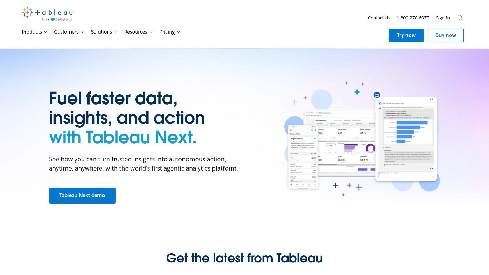
Its real strength is the sheer depth of its visualisation capabilities. The drag-and-drop interface in Tableau Desktop feels intuitive… but underneath that simplicity is a huge amount of power for creating custom, interactive visualisations. For Australian enterprises, the option for data residency via Salesforce’s Hyperforce infrastructure is a significant compliance win, which is a nice little bonus.
However, this power comes at a cost. The per-user licensing model can quickly become expensive as your team scales, particularly if you need the advanced data management and governance features. It’s one of the best data visualisation tools on the market, but you’ll definitely need to plan your budget carefully.
Website: https://www.tableau.com/
Key Considerations:
- Best For: Enterprises needing deep, customisable visual analytics and a mature, well-supported platform.
- Deployment: Flexible options with Tableau Cloud (SaaS) or a self-hosted Tableau Server.
- Pricing: Tiered, per-user licensing that starts with Tableau Viewer and scales up to Creator licences.
- Limitations: The cost structure can be a barrier for wider, organisation-wide adoption.
2. Microsoft Power BI
If Tableau is the long-established heavyweight, Microsoft Power BI is the incredibly popular contender that has rapidly gained ground. Especially within organisations already invested in the Microsoft ecosystem. Its biggest advantage is its seamless integration. If your team lives in Excel, Teams, and Azure, Power BI feels like a natural extension, not a separate, bolted-on tool. It’s designed for broad adoption, from self-service analytics by business users to centrally governed enterprise reporting.
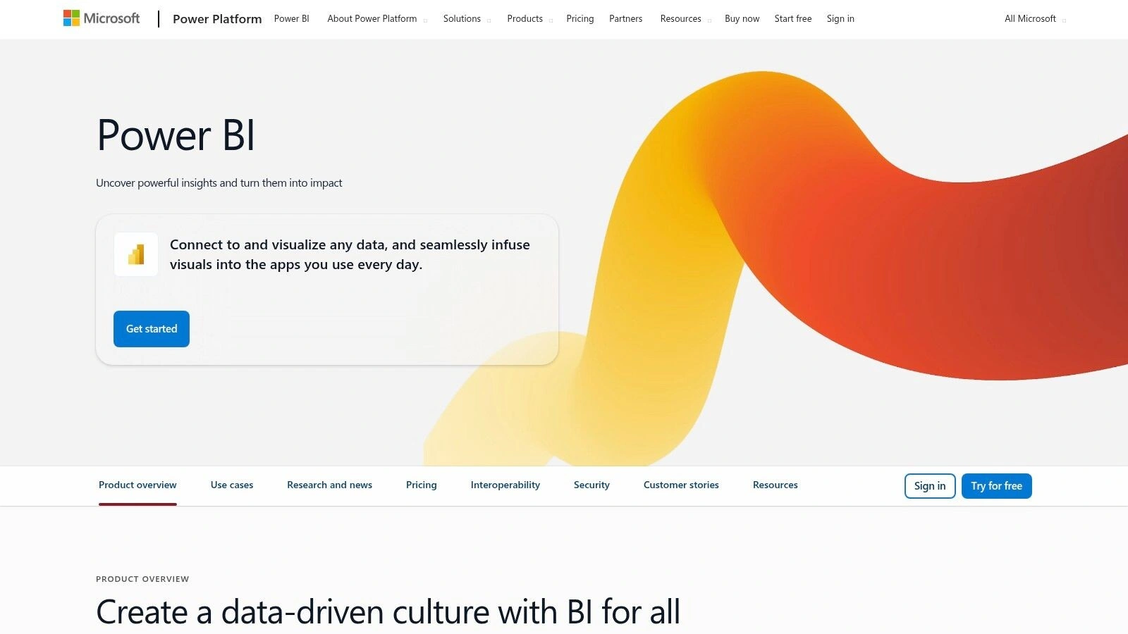
The platform’s strength is its accessibility and its price-to-performance ratio. It’s just great value. You can get started for a very low cost, which makes it one of the best data visualisation tools for company-wide deployment. For Australian businesses, the ability to use local data hosting addresses key data sovereignty and latency concerns. As part of the broader Microsoft Fabric platform, it also provides a clear pathway to more advanced analytics and data science capabilities. Understanding the fundamentals is key; you can learn more about data analytics on osher.com.au to get a solid foundation.
Website: https://powerbi.microsoft.com/
Key Considerations:
- Best For: Organisations deeply integrated with Microsoft 365 and Azure needing a scalable, cost-effective BI solution.
- Deployment: Primarily a SaaS offering (Power BI Service), with options for on-premises reporting via Power BI Report Server.
- Pricing: Very competitive per-user licensing, with more advanced features tied to capacity-based Premium/Fabric SKUs.
- Limitations: Capacity planning for Premium/Fabric tiers can be complex, and some visualisations feel less polished than competitors.
3. Qlik (Qlik Cloud Analytics/Qlik Sense)
Qlik’s approach is a bit different from many of the other best data visualisation tools out there. Its claim to fame is the “Associative Engine.” Which is just a fancy way of saying it lets you explore data in a less linear way. Instead of being locked into a specific query path, you can click on any data point and see all the relationships, even the unexpected ones, across your entire dataset. It’s a very natural way to uncover insights you weren’t even looking for.
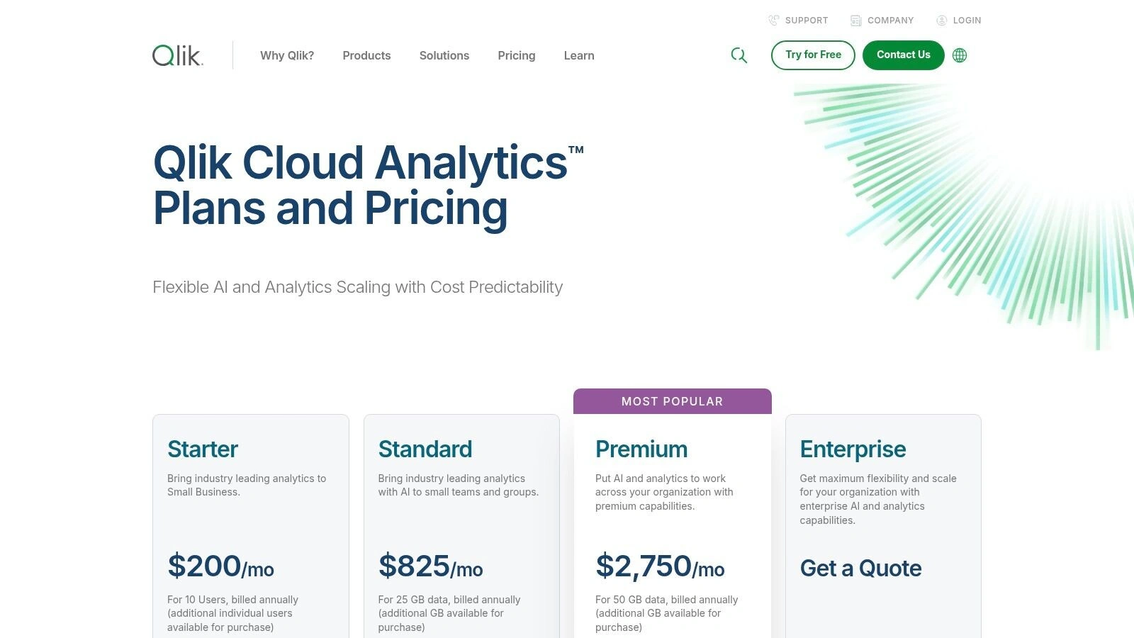
Qlik Cloud Analytics really leans into this with AI-augmented features like Insight Advisor, which helps you build charts and find patterns using natural language. This focus on governed self-service means business users get the freedom to explore, while IT maintains control over the data sources and models. It tries to strike that perfect balance between user empowerment and enterprise-grade governance.
The platform also includes powerful automation and reporting features, making it a comprehensive solution beyond just dashboards. However, its pricing isn’t transparent; you’ll need to contact sales to get a clear picture. The capacity-based models are flexible but can have a learning curve when it comes to predicting usage and managing costs effectively.
Website: https://www.qlik.com/us/pricing
Key Considerations:
- Best For: Organisations that want to empower business users with non-linear, associative data exploration and AI-driven insights.
- Deployment: Primarily a SaaS platform with Qlik Cloud Analytics.
- Pricing: Mix of user-based and capacity-based subscription tiers that require a sales consultation for specifics.
- Limitations: The lack of public pricing makes initial budgeting difficult, and the capacity metrics can be complex to manage initially.
4. Google Looker Studio (and Looker Studio Pro)
For teams already deep in the Google ecosystem, Looker Studio feels like a natural extension. It’s a free, browser-based tool that makes creating and sharing dashboards incredibly straightforward. Especially if your data lives in Google Analytics, BigQuery, or Sheets. You can get a decent-looking report up and running in minutes, which is its main superpower… accessibility.
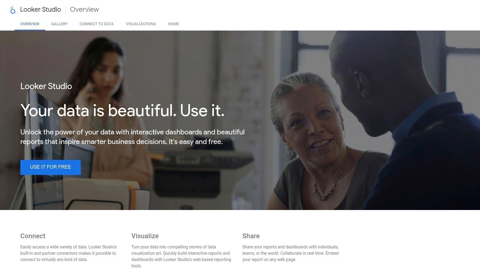
The real game-changer for businesses is Looker Studio Pro. This paid tier adds the enterprise-grade governance and collaboration features that the free version lacks. Think team workspaces, asset ownership controls, and automated report delivery. It bridges the gap between a quick, simple visualisation tool and a more managed BI solution. While it’s not as deep as core Looker, its tight integration and ease of use make it one of the best data visualisation tools for teams wanting to move fast without a massive initial investment.
Website: https://lookerstudio.google.com/
Key Considerations:
- Best For: Teams heavily invested in the Google Cloud and marketing ecosystem needing a fast, accessible, and collaborative dashboarding tool.
- Deployment: Fully cloud-based SaaS.
- Pricing: Core Looker Studio is free. Looker Studio Pro is a paid upgrade requiring an active Google Cloud project.
- Limitations: While powerful, it may lack the advanced modelling and data governance capabilities needed for highly complex, large-scale enterprise scenarios.
5. Looker (Google Cloud core)
Looker, now a core part of Google Cloud, takes a fundamentally different approach to business intelligence. Instead of just letting users drag and drop fields, it prioritises governance and a single source of truth through its powerful semantic modeling layer, LookML. This isn’t just a data visualisation tool; it’s a platform designed to create a reliable, consistent data language across your entire organisation.
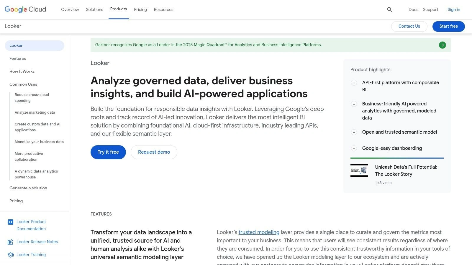
The real magic happens when you define your business logic and metrics in LookML once. Then, anyone in the business can explore that governed data, knowing the calculations are standardised and trustworthy. It’s a game-changer for organisations trying to move away from chaotic, conflicting reports. For developers, its API-first design and mature embedding capabilities are exceptional, making it one of the best data visualisation tools for integrating analytics directly into your products.
However, this governance-first model requires a significant upfront investment in learning and maintaining LookML. You need dedicated developers to build out the semantic layer before business users can really get value. The pricing is also tailored for enterprise budgets, based on annual contracts that require a conversation with sales, so it’s a serious commitment.
Website: https://cloud.google.com/looker
Key Considerations:
- Best For: Data-mature enterprises wanting a governed, single source of truth and powerful embedded analytics capabilities.
- Deployment: Fully managed within the Google Cloud Platform.
- Pricing: Custom pricing based on annual contracts (Standard, Enterprise, Embed editions); requires sales engagement.
- Limitations: The reliance on LookML creates a steep learning curve and a potential bottleneck if you lack development resources.
6. Amazon QuickSight (AWS)
If your organisation is already deeply embedded in the AWS ecosystem, Amazon QuickSight is a natural fit. A very natural fit. It’s a completely serverless, cloud-native BI service designed for seamless integration with AWS data sources like Redshift, S3, and Athena. You’re not just buying a tool; you’re plugging into an extension of your existing cloud infrastructure.
Its biggest drawcard is the pricing model, which can be incredibly cost-effective, especially when you need to share dashboards with a huge number of read-only users. The introduction of Amazon Q brings generative BI capabilities, allowing users to ask questions in natural language and explore data without needing to write complex queries. For Australian businesses, its availability in the Sydney region is a crucial point for data residency and low latency.
That said, its strength is also its main limitation. QuickSight shines brightest when your data already lives in AWS. If you’re working in a multi-cloud environment, you might find it less flexible than other, more vendor-agnostic tools on this list.
Website: https://aws.amazon.com/quicksight/
Key Considerations:
- Best For: Organisations heavily invested in the AWS ecosystem needing a scalable, cost-effective BI solution.
- Deployment: Fully managed, serverless SaaS on AWS.
- Pricing: Flexible with per-user subscriptions or capacity-based pricing for large-scale viewing.
- Limitations: Tightly coupled with the AWS ecosystem, which can be a drawback for multi-cloud strategies.
7. Grafana (Grafana Labs)
If your world revolves around real-time operational data… like metrics, logs, and traces… then Grafana is probably already on your radar. It’s the de facto standard for observability and monitoring dashboards. Originally an open-source project, it has grown into a powerful platform that excels at visualising time-series data from sources like Prometheus, Loki, and countless others. You’re not just building charts; you’re building a live view into the health of your systems.
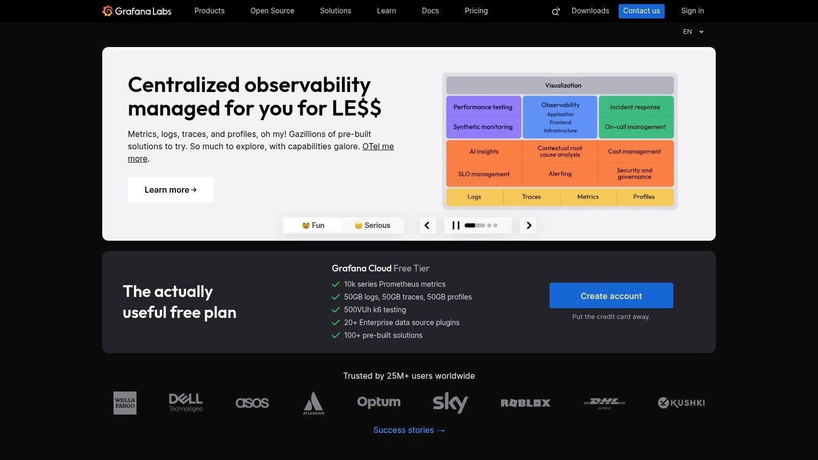
Its core strength is its focus. Unlike general-purpose BI tools, Grafana is purpose-built for the fast-moving, high-cardinality data common in IT operations, DevOps, and IoT. The extensible plugin ecosystem means you can connect to almost any data source imaginable and customise your dashboards extensively. It’s fantastic for creating the kind of operational displays seen in these business dashboard examples.
The trade-off for this specialisation is that it isn’t always the best fit for traditional business intelligence or financial reporting. While you can connect to SQL databases, its sweet spot remains operational data. The managed Grafana Cloud has a generous free tier, but scaling up or adding enterprise features will require a budget, and self-hosting demands real operational expertise.
Website: https://grafana.com/
Key Considerations:
- Best For: DevOps and SRE teams needing real-time observability dashboards and alerting on operational data.
- Deployment: Flexible with open-source (self-hosted), Grafana Cloud (SaaS), and Grafana Enterprise options.
- Pricing: Starts with a generous free tier on Grafana Cloud, with Pro and Advanced plans scaling on usage.
- Limitations: Less suited for traditional business analytics; scaling a self-hosted instance requires significant technical knowledge.
8. Highcharts
Highcharts isn’t a drag-and-drop BI platform like some others on this list; it’s something different and, for developers, something truly powerful. Think of it as a professional-grade charting engine for your own applications. It’s a JavaScript library that lets you embed beautiful, interactive, and highly performant charts directly into your web products or internal dashboards. You’re not using their platform, you’re building on top of their technology.
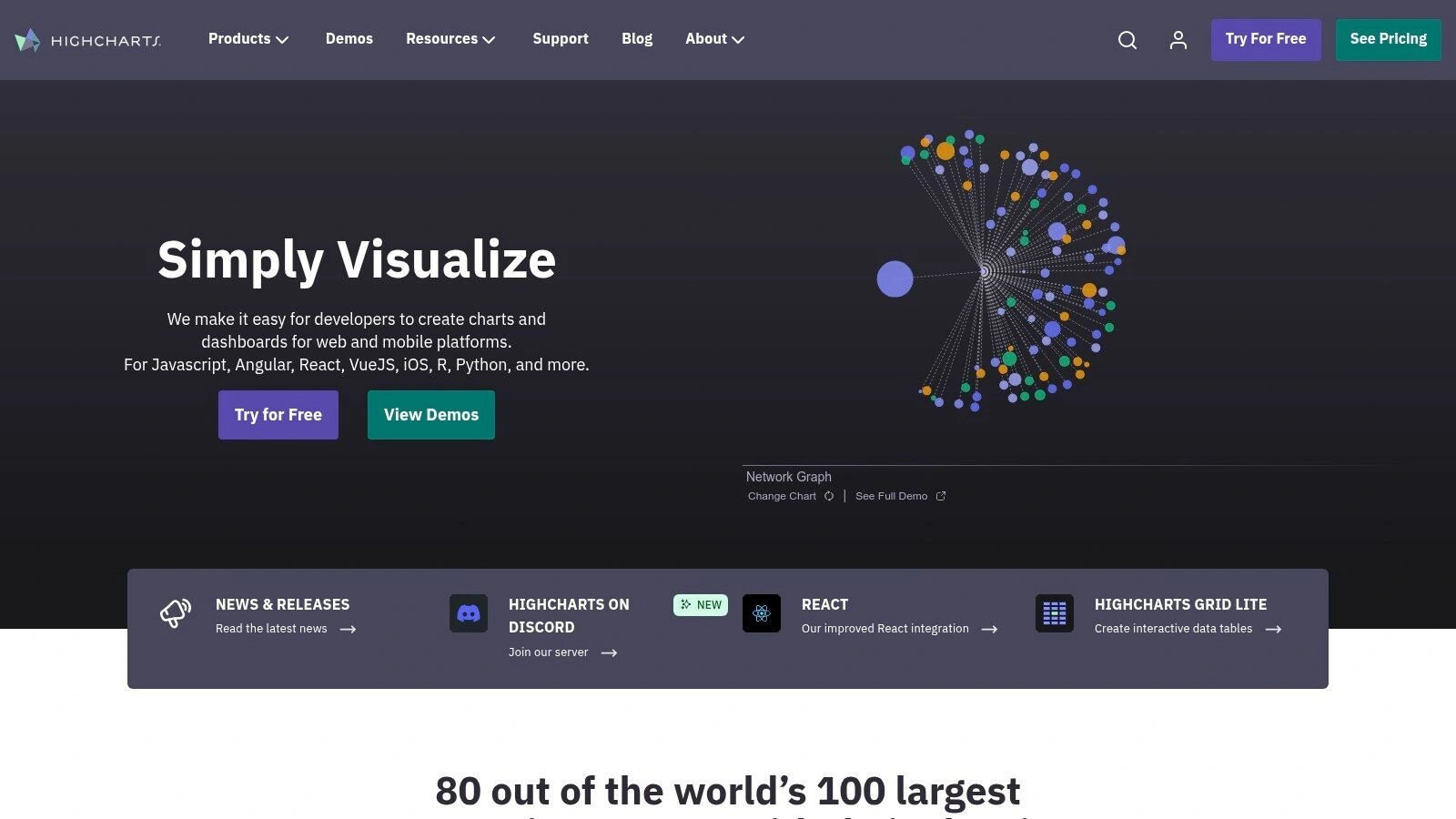
Its real magic is in its flexibility and developer-centric approach. The documentation is fantastic, and the sheer number of chart types available is immense, covering everything from standard financial charts to complex network graphs. For companies building their own SaaS products or needing custom-branded analytics embedded into their customer portals, Highcharts provides the building blocks without forcing you into a specific BI vendor’s ecosystem. It’s one of the best data visualisation tools for in-app analytics.
The main thing to realise is that this is a developer’s tool. You need coding expertise to implement it. Licensing is also a key consideration; it’s free for non-commercial use, but commercial projects require a paid licence, with pricing structured around specific use cases like internal dashboards, SaaS, or OEM distribution.
Website: https://www.highcharts.com/
Key Considerations:
- Best For: Development teams needing to embed high-quality, interactive charts into their own web applications or platforms.
- Deployment: A JavaScript library integrated directly into your own web project’s front-end code.
- Pricing: Free for non-commercial use. Commercial licensing is required and varies based on the deployment model (internal, SaaS, OEM).
- Limitations: Requires development resources and coding skills to implement; it is a library, not a standalone analytics platform.
9. Plotly Dash Enterprise
Plotly Dash Enterprise isn’t your typical off-the-shelf BI tool. Instead, it’s a framework for Python developers to build, deploy, and scale highly interactive, custom analytics applications. If your organisation runs on Python and you need more than a standard dashboard, this is where you turn. You’re not just creating charts; you’re building full-stack data apps without needing to be a frontend expert.
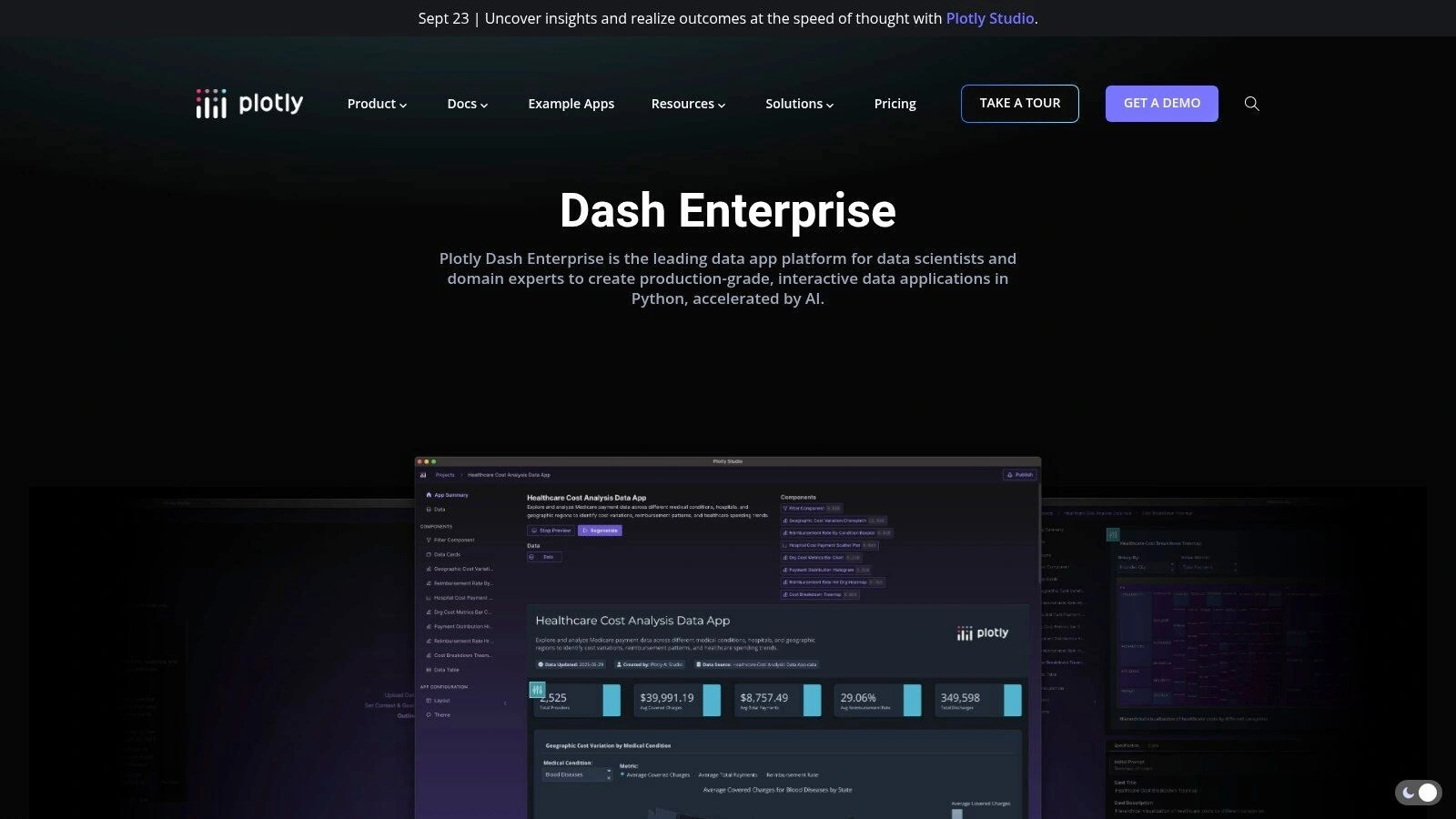
Its real power lies in bridging the gap between data science models and business users. A data scientist can build a complex model and then use Dash to create a user-friendly web app around it, complete with sliders, dropdowns, and live updates. The platform handles the tricky parts like authentication, CI/CD, and scaling, letting your team focus on the analytics. It’s a very different approach to something like Tableau.
However, this is a developer-centric platform. It requires coding knowledge and, if you self-host, infrastructure management. Pricing is quote-based and aimed at enterprise use cases, so it’s a significant investment. It’s one of the best data visualisation tools for building bespoke solutions, but it’s not a simple drag-and-drop experience.
Website: https://plotly.com/dash/
Key Considerations:
- Best For: Organisations with strong Python development teams needing to build custom, interactive data applications.
- Deployment: Highly flexible with managed services or self-hosted options on AWS, Azure, Google Cloud, or on-premises.
- Pricing: Enterprise, quote-based pricing. You’ll need to contact sales for specifics.
- Limitations: Requires Python programming skills and is more of a “build” than a “buy” solution for business intelligence.
10. Preset (Managed Apache Superset)
If you love the flexibility and power of open-source but don’t want the headache of managing the infrastructure, Preset is your answer. It’s a fully managed, cloud-native business intelligence platform built on top of the popular Apache Superset. This gives you the best of both worlds: a powerful, modern, open-source core without the operational overhead of self-hosting, patching, and scaling. It’s a smart way to get enterprise-grade BI without the enterprise-level price tag or vendor lock-in.
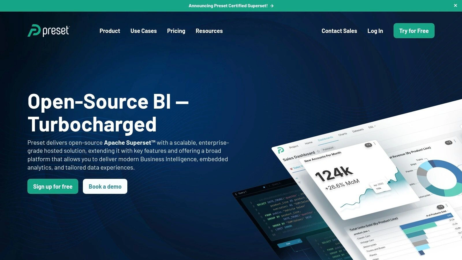
Preset shines by making Superset accessible and secure. You get a drag-and-drop chart builder for quick visualisations, but also direct access to a SQL Lab for when your analysts need to dig deeper. Its real value for organisations is in its management features like role-based access control, SOC 2 compliance, and a generous “free forever” plan for small teams. It’s one of the best data visualisation tools for teams who want to avoid vendor lock-in, as you can always export your work back to open-source Superset if you decide to leave the platform.
Website: https://preset.io/
Key Considerations:
- Best For: Teams that want the power and customisation of open-source BI (Apache Superset) without the infrastructure management burden.
- Deployment: Fully managed cloud-native SaaS platform.
- Pricing: A generous “Free forever” Starter plan for up to 5 users, with paid plans that are cost-effective as you scale.
- Limitations: While the UI is friendly, building complex data models can still require solid SQL expertise. Key enterprise features like SSO are reserved for paid tiers.
11. Zoho Analytics
Zoho Analytics positions itself as an accessible, all-in-one business intelligence and analytics solution. Particularly for small to medium-sized businesses already within the Zoho ecosystem. But its appeal is broader. It’s designed for rapid deployment, letting you connect to a huge range of data sources and start visualising in minutes, not days.
Its key differentiator is the combination of simplicity and breadth. The platform offers a huge library of pre-built reports and dashboards for popular business apps, which is a massive time-saver. Plus, its AI assistant, Zia, allows users to ask questions in natural language and get back instant charts and reports. This really lowers the technical barrier for a lot of team members. And of course, having solid data preparation pipelines is crucial, because good visuals depend on effective data quality management.
The main trade-off comes with scale. While it’s incredibly cost-effective to start, the limits on data rows and users in lower-tier plans mean you need to plan carefully as your data volume grows. For complex, large-scale enterprise needs, you might find yourself hitting those limits sooner than expected.
Website: https://www.zoho.com/analytics/
Key Considerations:
- Best For: SMBs and teams needing a fast, affordable, and user-friendly BI tool with strong out-of-the-box integrations.
- Deployment: Fully cloud-based (SaaS), with options for on-premise deployment.
- Pricing: Starts with a generous free plan, then scales with tiered subscription plans based on users and data volume.
- Limitations: Can become restrictive for massive datasets or highly complex enterprise deployments without upgrading to higher-tier plans.
12. Yellowfin BI (Australia-founded)
Yellowfin BI is an interesting one, especially for companies looking beyond just charts and graphs. This Australian-founded platform really leans into the idea of “data storytelling” and automated analysis. It’s not just about showing you what happened; it tries to tell you why it happened by automatically surfacing trends and outliers, which is a genuinely different approach.
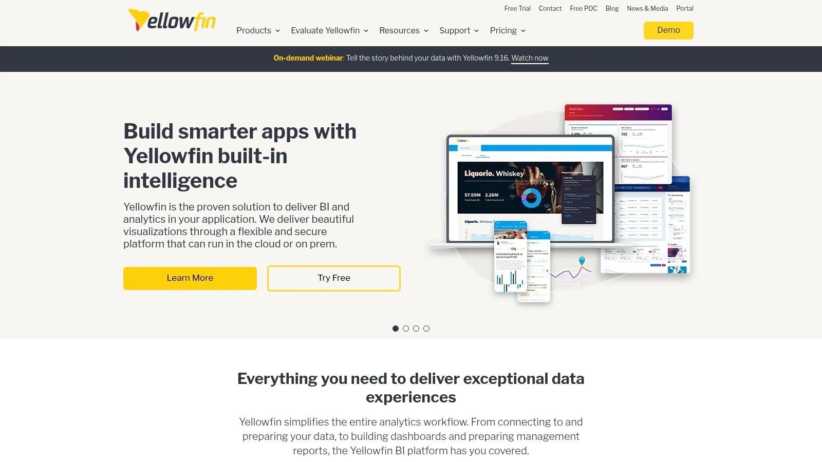
Its real standout feature is how it’s built for embedding. If you’re an independent software vendor (ISV) or an enterprise wanting to white-label analytics right into your own application, Yellowfin’s flexible and often predictable pricing models are a massive plus. They move away from the rigid per-user costs that can make embedded projects a nightmare to budget for. It’s one of the best data visualisation tools for this specific use case.
The main catch is that you won’t find a price tag on their website. You have to engage with their sales team to get a quote, which can slow things down. And while it’s a powerful tool, it doesn’t have the same huge market presence or community size as some of the bigger players.
Website: https://www.yellowfinbi.com/
Key Considerations:
- Best For: ISVs and enterprises needing deeply embedded, white-labelled analytics with flexible, OEM-friendly commercial models.
- Deployment: Can be deployed on-premises or in a private or public cloud.
- Pricing: Customised pricing models based on use case (e.g., named user, server core, revenue share); requires a sales consultation.
- Limitations: Lack of public pricing information and a smaller community ecosystem compared to giants like Tableau or Power BI.
Top 12 Data visualisation Tools Comparison
| Solution | Core Features | User Experience & Quality | Value Proposition | Target Audience | Pricing & Licensing |
|---|---|---|---|---|---|
| Tableau (Salesforce) | Rich visual authoring, SaaS/self-hosted, large connector library | Deep visualisation, extensive ecosystem | Market leader in visualisation depth | Individuals to large enterprises | Per-user licensing; can get expensive |
| Microsoft Power BI | MS 365 & Azure integration, composite models, security | Competitive price/performance ratio | Strong Microsoft ecosystem integration | Enterprises in Microsoft environments | Subscription with premium add-ons |
| Qlik (Qlik Cloud Analytics) | Associative engine, AI-powered insights, automation | Flexible licensing; powerful data exploration | Capacity-based models, diverse connectors | Data-driven orgs needing scalable analytics | Pricing via sales contact; less transparent |
| Google Looker Studio & Pro | Free tool with Pro adding governance, alerts, team workspaces | Easy sharing, natural language prompts | No cost base product; Pro adds collaboration | Small teams to enterprises | Free core; Pro requires Google Cloud billing |
| Looker (Google Cloud) | Semantic modeling, embedded analytics, API-first | Strong governance, scalable reporting | Enterprise-grade BI with embedding | Enterprises needing governed metrics | Annual contracts, sales engagement required |
| Amazon QuickSight (AWS) | Serverless, natural language BI, AWS integration | Cost-effective for large readers | AWS native with AU data residency | AWS users with scalable BI needs | Per-user or capacity pricing |
| Grafana (Grafana Labs) | Observability focused, plugins, multi-tier plans | Free tier, extensible, operational dashboards | Great for monitoring & alerts | DevOps, IT, observability teams | Free + Pro plans; enterprise add-ons extra |
| Highcharts | Commercial JavaScript charting library | Strong documentation & support | Flexible licensing for embedded use | Developers embedding charts | Paid licenses; varies by usage |
| Plotly Dash Enterprise | Python app platform, CI/CD, multi-cloud support | Developer-friendly for custom apps | Custom interactive analytics | Python developers & analytics teams | Quote-based; complex; requires infra |
| Preset (Managed Superset) | Managed Apache Superset, role-based security, alerts | Free Starter plan, easy open-source use | Cost-effective open-source BI | Small to medium teams | Free starter; paid Creator plans |
| Zoho Analytics | Broad connectors, AI assistant, templates | Affordable, easy setup and sharing | SMB-focused with AI-powered insights | SMBs and teams | Affordable entry; limits on rows/users |
| Yellowfin BI (Australia) | Narrative dashboards, automated alerts, embedded options | Strong storytelling, OEM-focused pricing | Flexible pricing for OEMs & enterprises | OEMs, ISVs, enterprises | Custom pricing; sales engagement required |
So, What’s the Next Step? Making the Data Work for You.
Okay, that was a lot. We’ve just navigated a serious landscape of data visualisation tools, from the absolute giants like Tableau and Power BI to the more specialised, developer-focused players like Plotly Dash and Grafana.
After going through all that, it’s completely normal to feel a bit of analysis paralysis. You’re probably sitting there thinking, “Which one is perfect?” It’s a fair question, but maybe not the right one.
The honest answer? None of them. And all of them.
Finding Your Best Data Visualisation Tool
The truth is, the search for the single “best data visualisation tool” is a bit of a wild goose chase. The best tool isn’t the one with the longest feature list or the flashiest marketing. It’s the one that aligns with the unique rhythm of your organisation.
It all comes down to a few key questions you need to ask internally:
- Who is this for? Are we equipping a team of seasoned data analysts who can write SQL in their sleep (hello, Looker), or are we empowering the marketing department to build their own dashboards without needing to call IT (a classic Power BI use case)? User skill level is everything.
- Where does our data live? Your tech stack is a massive factor. If your entire world is built on AWS, a tool like Amazon QuickSight will feel like a native extension. Heavily invested in the Microsoft 365 ecosystem? Power BI’s integration is almost impossible to beat. Don’t fight your own infrastructure.
- What problems are we really trying to solve? Are you tracking real-time server performance, needing millisecond updates? Grafana is built for that. Are you trying to create beautiful, shareable reports for your board of directors? Something like Tableau or even Zoho Analytics might be a better fit. Get specific about the pain point.
The Problem Before the Problem
Sometimes, the real challenge isn’t picking the visualisation tool. It’s the messy, complicated groundwork that comes before it. Let’s be real… the hard yards are spent getting all your data to talk to each other in the first place.
You can have the most powerful, expensive BI tool on the market, but if it’s fed inconsistent, siloed, or just plain messy data, your beautiful dashboards will be telling you beautiful lies. Garbage in, garbage out. It’s an old saying because it’s true.
This is the part of the journey where most projects stall. It’s not glamorous, but unifying your data sources and automating the flows is the foundation upon which every valuable insight is built. You have to get the plumbing right before you can turn on the tap. So, take a breath. Don’t rush into a big software decision. Play with some free trials, get your team involved, and be brutally honest about your biggest data frustrations.
Feeling like your data is the biggest hurdle? That’s where we come in. At Osher Digital, we specialise in connecting those disparate systems and building the automated data pipelines that make these tools sing. We’re vendor-agnostic, so our only focus is finding the right strategy for you.
Let’s have a chat about getting your data ready for visualisation.
Jump to a section
Ready to streamline your operations?
Get in touch for a free consultation to see how we can streamline your operations and increase your productivity.