Business Process Mapping: When to Use Each Technique
Ten process mapping techniques and the one situation each is actually built for. Practitioner notes on flowcharts, swimlanes, BPMN, VSM, and SIPOC.
By Matthew Clarkson · June 21, 2025
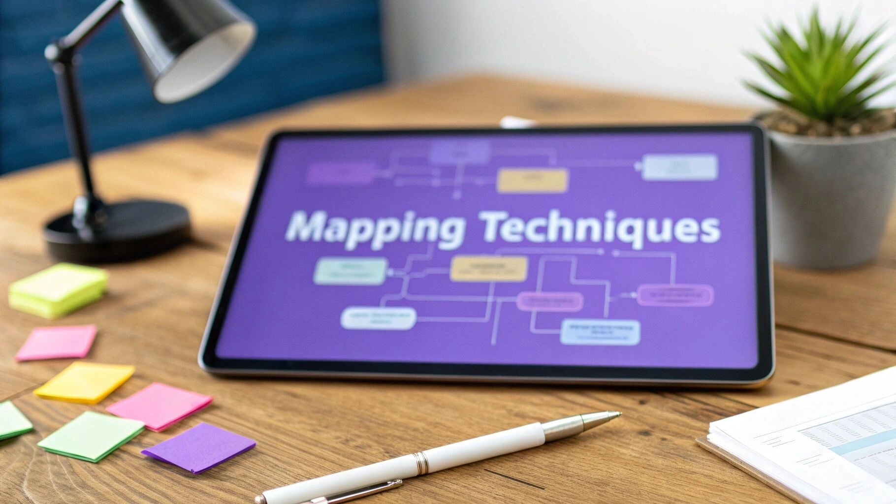
Updated May 2026. Rewritten to focus on which technique fits which problem, with the four we reach for most weeks and the ones we leave on the shelf.
Most process maps die in a SharePoint folder. The ones that survive get used for a single, specific decision: which step to automate, which handoff to fix, which team owns which approval. That is the whole game. Pick the technique that answers your question, draw the smallest map that will do, and stop.
A good process map often becomes a build specification. That is how our custom job management systems start, with the map you already drew.
We run process audits and automation builds for clients out of Brisbane. After enough engagements across healthcare, finance, professional services, and recruitment, you stop arguing about which notation is “best” in the abstract. You start asking what decision is on the table. A flowchart and a BPMN diagram are both correct answers to different questions, and treating them as interchangeable wastes a workshop.
This guide walks through the ten techniques that get name-checked in most process mapping articles, with an opinion attached to each: when it earns its place, when it is overkill, and what we actually reach for first when a client lands on a problem. The list overlaps with our business process analysis template and is the natural prequel to AI-assisted workflow work.
One more thing before the techniques. If you skip the “what decision are we trying to make” step, no notation will save you. Flowcharts default to wallpaper. BPMN turns into a documentation graveyard. The technique is downstream of the question.
How we pick a mapping technique
The question we ask first is almost never “what notation should we use?” It is some version of “what are we trying to find out?” Common variants we hear: handoffs are slow, errors keep landing in one team, cycle time blew out, a regulator is asking for evidence, we want to automate this and need a spec the developer can read. Each of those points at a different map.
If you only remember four of the ten techniques below, make them flowcharts, swimlane diagrams, BPMN, and SIPOC. Those cover a surprising amount of real work. Customer journey maps and value stream mapping earn their place when the problem is genuinely about experience or cycle time. The rest (UML activity diagrams, detailed process maps, lean process maps, process flow analysis) overlap with the four above more than their names suggest.
A short heuristic we use in workshops, with the question first and the right technique second:
- Whose job is this step? Swimlane diagram.
- Why does this take so long? Value stream map with cycle and wait times.
- How will the developer build this? BPMN 2.0.
- What is even in scope? SIPOC.
- Why is the customer unhappy? Customer journey map with real interview data.
- What does this look like at 30,000 feet for a non-technical exec? A plain flowchart, half a page, no jargon.
Everything else (UML activity diagrams, detailed process maps, lean process maps, process flow analysis) is a variation on those six answers. Knowing the six gets you most of the way.
Flowcharts: the default, and the limits
Boxes for actions, diamonds for decisions, arrows for sequence. Flowcharts work because nearly everyone in the room already reads them. There is no notation training cost, no software lock-in, and a whiteboard photo is enough to start.
We use a flowchart when the goal is shared understanding within one team, when training a new joiner, or when sketching a target process at 30,000 feet for an executive who is not going to read more than half a page. They are the fastest way to surface where a process actually branches versus where everyone tells you it is “linear” (it is rarely linear).
Flowcharts fall over when the process spans teams. Pure flowcharts hide responsibility. They also fall over when developers are going to execute the model: there is no formal semantics, so two readers can build two systems from the same diagram. For both of those failure modes, the next two techniques are the answer.
Swimlane diagrams: when the handoffs are the problem
A swimlane diagram is a flowchart with horizontal or vertical lanes, one per role or system. The single most useful feature of the format is also the most obvious: every step has a clear owner. Whenever someone in a workshop says “we just need to fix this handoff”, the right answer is a swimlane.
We reach for swimlanes for onboarding flows (sales to operations to finance), claims and approvals, anything with a compliance review, and almost every recruitment workflow. The pattern is consistent: most of the delay sits in lanes that touch the process for ten minutes and then sit on it for two days. A talent marketplace client we worked with had a placement flow that nominally took five working days. The swimlane revealed that work-in-progress was sitting in the legal lane for an average of 38 hours waiting for someone to notice a Slack message. The fix was a status dashboard and a 24-hour escalation rule, not new software.
One pitfall to watch. Swimlanes tempt people to add more lanes than they need. If you find yourself drawing a “system” lane for every internal tool, that map will not be read. Group systems into a single lane unless they are genuinely owned by different teams.
BPMN: when developers will execute the model
BPMN 2.0 (Business Process Model and Notation) is a standardised notation with formal semantics. Events, activities, gateways, message flows, exception handlers. The vocabulary is much larger than a flowchart and exists for a reason: a BPMN model can be machine-executed by a workflow engine.
We use BPMN when the next thing after the diagram is a developer (or an n8n workflow, or a Camunda model) implementing the process. The discipline of being explicit about “what fires this step?” and “what happens if it times out?” is exactly what an automation needs. For an internal-only audience that is never going to execute the model, BPMN is usually overkill. Stick to swimlanes.
The single biggest debugging session we have lost time on was a BPMN model where the developer read an exclusive (XOR) gateway as inclusive. Two parallel branches kept firing on every run. If you are handing BPMN to a build team, mark the gateway types explicitly and walk through one example end to end. If you are working with our n8n consultants on an automation project, the BPMN comes out only when the logic is intricate enough to warrant it. Most automations live happily on a swimlane plus a task-level table.
Value stream mapping: when cycle time is the constraint
Value Stream Mapping (VSM) comes out of Toyota and the lean tradition. The point is to walk the actual flow of work end to end, measure cycle time and wait time at each step, then mark each step as value-adding, necessary non-value-adding, or waste. The output is a current-state map with hard numbers and a future-state map with a clear target.
VSM earns its place when the dominant complaint is “this takes too long” and the process spans more than one team. We have run a VSM on accounts receivable for a professional services firm where the workshop revealed that 80 percent of total cycle time was wait time between approvals. None of the actual work steps needed faster execution; they needed escalation rules and a default approver after 48 hours. Days-sales-outstanding dropped from 51 days to 38 over the following quarter.
Where we do not use VSM: short processes, knowledge work that varies heavily by case, anything where the cycle time problem is already obvious. A two-week mapping exercise to confirm what the team already knows is its own kind of waste.
Customer journey maps: when the friction is outside-in
Internal maps assume the customer is roughly happy. Customer journey maps drop that assumption. They follow one persona through every interaction with your organisation, capturing what the customer does, what they expect, what actually happens, and how they feel about it.
This is the right tool when churn is the symptom, when NPS is dropping without a clear internal cause, or when the operations team and the customer are both unhappy and pointing fingers. A good customer journey map will show the same touchpoint appearing in three different internal swimlanes and explain why the customer is being asked the same question three times.
The half-version that does not work: drawing a journey map without any customer research. Inferred journeys read as marketing artefacts and rarely change a decision. Five recorded interviews and three call recordings get you something defensible. Less than that, and you are mapping your own assumptions.
SIPOC: a scoping tool, not a process model
SIPOC stands for Suppliers, Inputs, Process, Outputs, Customers. The “process” column is the catch: SIPOC only asks for the five or six high-level steps. It is not a process map. It is a one-page agreement on scope and direction.
We use SIPOC at the start of nearly every engagement. Twenty minutes on a whiteboard, in the room with the actual process owners, and you walk out with a shared definition of where the process starts, where it ends, who feeds it, and who consumes the output. That is more useful than it sounds. Most disagreements about a process map come from disagreements about scope that nobody surfaced.
If a workshop devolves into “are we mapping just AP or are we also including procurement?”, SIPOC is the answer. If you are already past that, skip it.
Detailed process maps, UML activity diagrams, and the overlapping rest
The remaining named techniques (detailed process maps, UML activity diagrams, process flow analysis, lean process mapping) overlap with the four above heavily. A “detailed process map” is usually a swimlane or BPMN diagram with extra detail in each task. A UML activity diagram is BPMN’s older sibling that did not win in industry but still shows up in software-led organisations.
The two cases where we have used them deliberately: a clinical workflow review that required documentation of every input, output, and exception for a healthcare regulator (detailed process map), and an integration design with a software team that had standardised on UML internally (UML activity diagram). In both, the underlying logic could have been captured in BPMN. The choice was about audience and existing convention, not capability.
Process flow analysis is a label for “walk through your process map and measure cycle time, throughput, and bottleneck stages.” It is what you do with a swimlane or VSM, not a separate technique. If a consultant lists it as a deliverable in addition to a process map, ask what extra you are paying for.
Lean process mapping is value stream mapping in a slightly different hat. Same intent, same outputs, slightly different terminology depending on whether the consultancy traces its lineage to Toyota or to Six Sigma.
Tools we actually use
Tooling is the second-most-overdiscussed topic in process mapping (after notation). Here is what we use, in priority order.
- A whiteboard and sticky notes. Cycle one: do it in the room, with the people who run the process, on a wall. Photograph it. This is still the highest signal output per hour for any new mapping exercise.
- Miro or Mural. Once the map needs to be shared, edited, or shown to people who were not in the room. Both work. We default to whichever the client already pays for.
- Lucidchart or draw.io. When the map needs to look formal for a deliverable, or when you want template-driven BPMN. Lucidchart for clients with a Confluence stack; draw.io for clients who do not want another subscription.
- Camunda Modeler. If the BPMN model will be executed by a workflow engine, this is the editor that matches the runtime.
- Notion or Confluence tables. For task-level detail under each step in a swimlane. A picture and a table together beat either alone.
We have used the big enterprise BPM platforms (ARIS, Signavio, Bizagi). They are excellent at what they do. They are also a six-figure annual commitment and assume a process improvement function that most mid-market organisations do not have. If you are not staffing a centre of excellence, the lighter stack above will do.
Where process mapping quietly fails
A few patterns we see often enough to call out.
The first is mapping with the wrong people in the room. If only the team leads attend, you get an idealised process. You need at least one person who does the work daily, and you need to ask them what the actual exception looks like (not the documented one). The “this almost never happens” branch usually happens 20 percent of the time.
The second is mapping for a deliverable rather than a decision. A 40-page binder with process maps for everything ages quickly and gets read by nobody. We have inherited two clients who paid five-figure sums for exactly that document and could not point at a single change it had produced. We refer to those as “shelf-ware audits”.
The third is mapping the as-is and never building the to-be. Mapping current state without committing to a target state is process anthropology. It is interesting and changes nothing. Always book the to-be workshop in the same week. If the client will not commit to it, the as-is workshop is probably not worth running either.
When mapping is not the right move
Mapping is the wrong starting move when the team already agrees on the problem and just needs to fix it. A two-week mapping engagement to confirm that the approval queue is the bottleneck is a tax on the people who already told you the answer.
It is also the wrong move when the process is brand-new and changing weekly. There is nothing to map yet. Run the process, take notes, and map it after three months when it has settled.
And it is the wrong move when the underlying issue is not a process issue. We have seen mapping exercises run on what turned out to be a staffing shortage, a misaligned incentive scheme, and a sales pipeline that fed downstream operations too unevenly. Notation does not fix any of those.
If you are weighing mapping against just starting an automation project, our piece on automation roadmaps covers the order we usually run. A short SIPOC plus a swimlane on the chosen process is often the right minimum. Anything more, and you risk over-investing in mapping before you have validated the target. Book a call if you want a second opinion on the right amount of mapping for your situation.
Frequently asked questions
What is the difference between a flowchart and a process map?
A flowchart is one specific type of process map. “Process map” is the umbrella term that includes flowcharts, swimlane diagrams, BPMN models, value stream maps, and others. If someone says “process map” without qualification, they usually mean a swimlane diagram or a basic flowchart.
Activity diagram vs BPMN: which should I use?
BPMN if you are documenting a business process, especially one that will be automated. UML activity diagrams if your organisation has standardised on UML for software design and you want the process map to live alongside other UML artefacts. BPMN has won in business contexts; UML still has a home in software-led teams.
How detailed should a process map be?
As detailed as the decision requires and no more. For a leadership discussion, 7 to 12 steps. For a developer who is going to automate the process, every decision, exception, timeout, and data movement. For a regulator, every step with input/output and ownership recorded. Pick the audience first.
What is the best approach to process mapping?
SIPOC for twenty minutes to agree the scope, then a swimlane diagram on a whiteboard with the people who actually run the process. Photograph the result, transcribe it into Miro or Lucidchart, and confirm with one or two follow-up sessions. Move to BPMN only if the next step is automation. Most engagements never need anything fancier.
How long does a process mapping exercise take?
A single process for a single team: half a day of workshops plus a day of write-up. A full-department audit with ten to fifteen processes: 4 to 8 weeks. An enterprise-wide process inventory: months, and usually not worth doing in one go. Most of our engagements live in the half-day to two-week range.
How much does process mapping cost?
A single workshop with a consultant is usually $2,000 to $5,000 AUD. A multi-process audit with documented current-state and to-be maps runs $15,000 to $40,000 AUD depending on scope. If a quote is materially above that for a defined scope, ask what you are getting that you do not need.
Should I use software to map, or paper?
Start on paper or a whiteboard. Always. Move to software when you need to share, version, or hand the map to a developer. Starting in software invites the team to debate notation instead of process. The bottleneck is honesty about how the work actually runs, not the prettiness of the diagram.
Do I need BPMN for automation?
No. A clean swimlane diagram is enough for most n8n, Make, or custom-code automations. BPMN earns its place when the workflow has many exception paths, message-driven steps between systems, or is going to run on a workflow engine that natively executes BPMN. Otherwise, swimlane plus a task-level Notion table is faster.
If you want a second pair of eyes on which technique fits the decision in front of you, that is usually a thirty-minute conversation. We have run hundreds of mapping sessions for clients across Australia and the UK, and we can usually point you at the right minimum mapping investment for your situation without dragging you into a full audit. Get in touch if a sanity check would help.
Last updated on August 6, 2026
Free tool · 2 minutes
Automation ROI Calculator
See what a manual process is really costing you, and the payback on automating it.
Continue Reading
View all
Rented software was always a compromise. AI has ended it.
Off-the-shelf software made sense when custom cost $250,000. AI-assisted development changed the maths. Why we now build software around the business, AI-first, and connected to Claude and ChatGPT, starting at $15k.
Aug 6, 2026

n8n Outlook Automation: Where the Node Stops and Graph Begins
n8n Outlook automation breaks in predictable places: subfolders, attachments, shifting email IDs, plus the Graph API workarounds we run in production.
Mar 16, 2026

What Is a Workflow? Definition, Parts, and What Breaks
A workflow is the repeatable set of steps that takes a task from start to finish. Here is what a workflow is made of, and the parts that quietly break.
Mar 1, 2026
Sick of reading about automation?
Book a free 15-minute intro call. We’ll talk through what you’re trying to automate and whether we’re a good fit.